Woolworths 2024
Role: Art Director / Graphic Designer / Copywriter
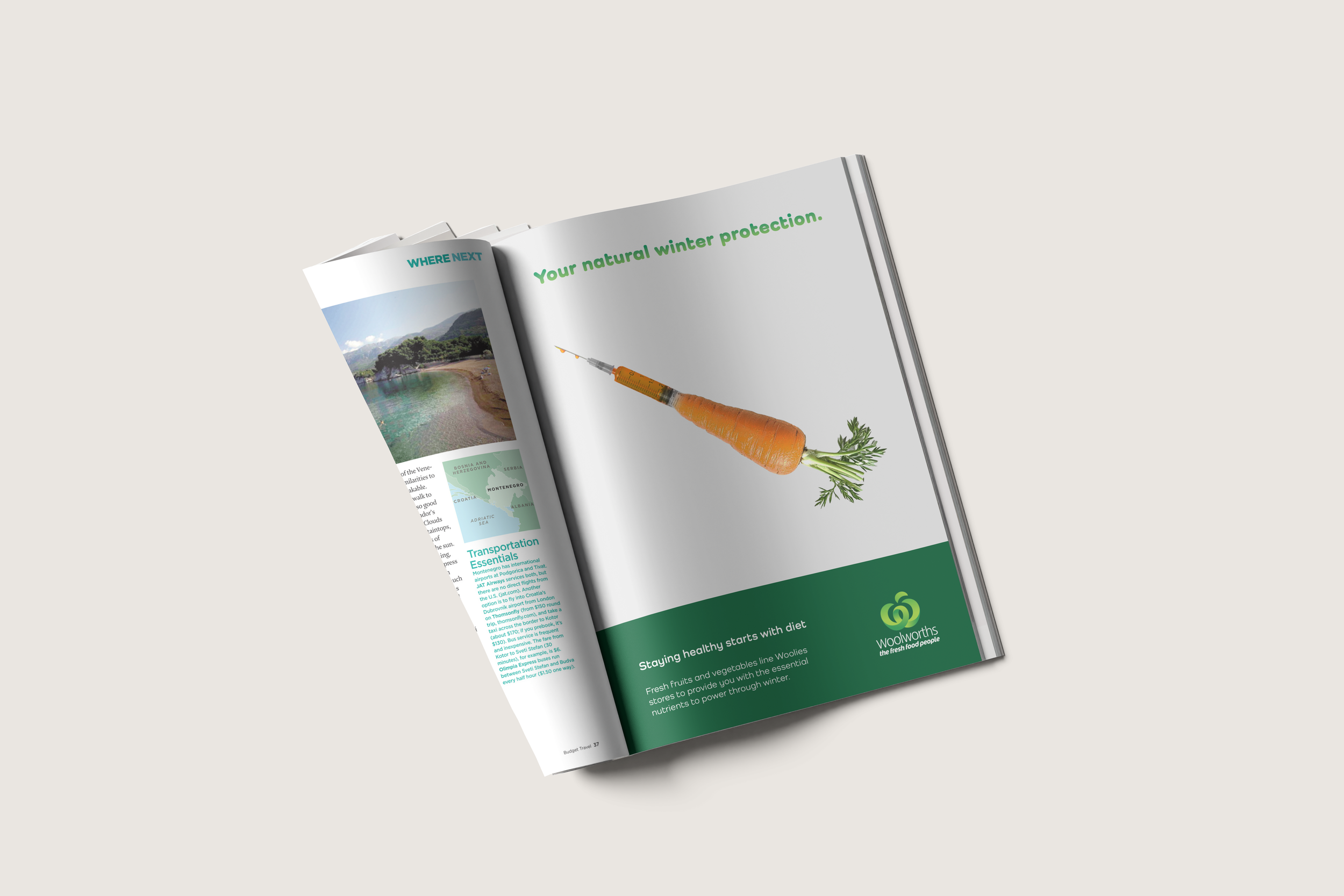
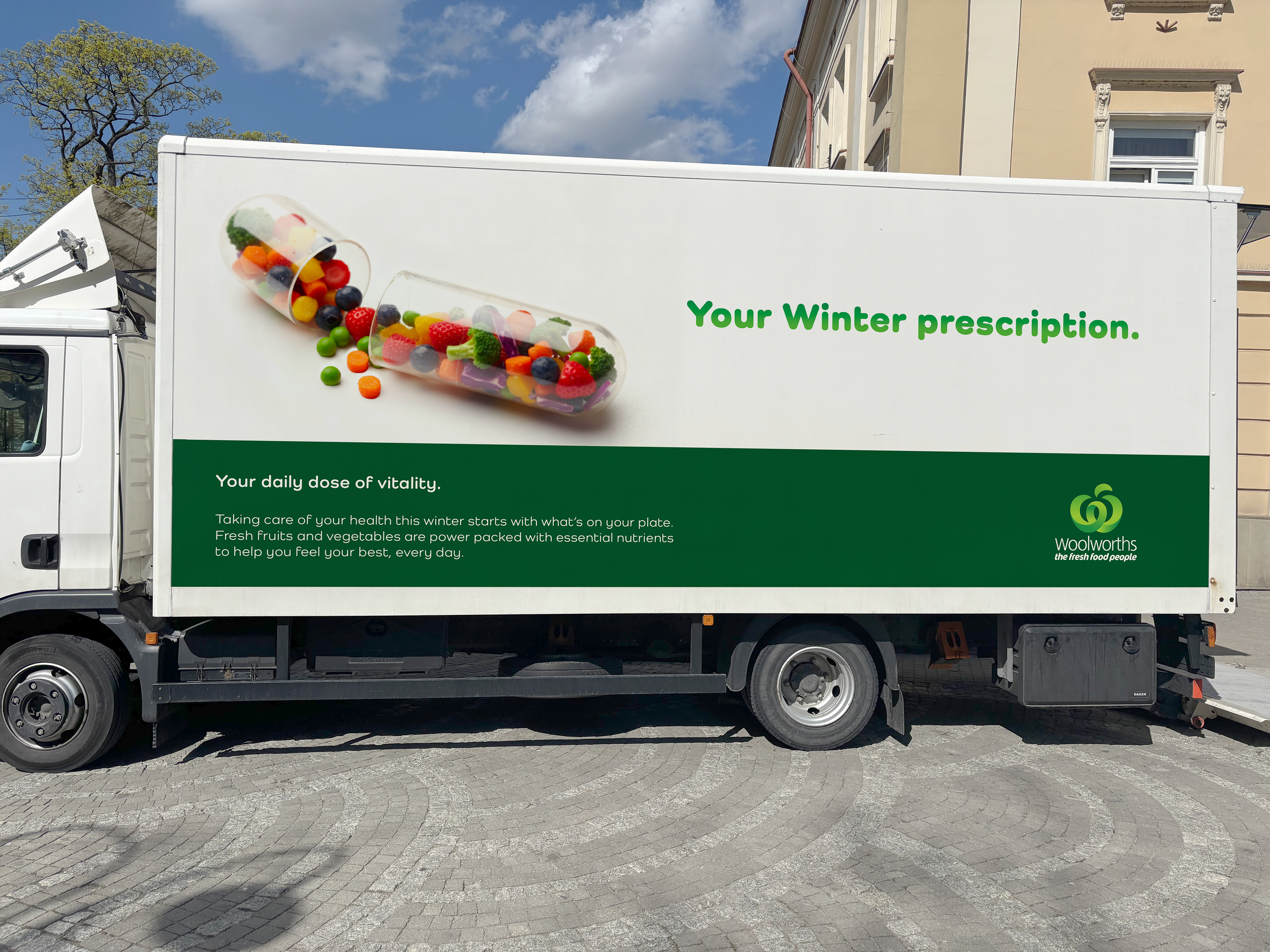
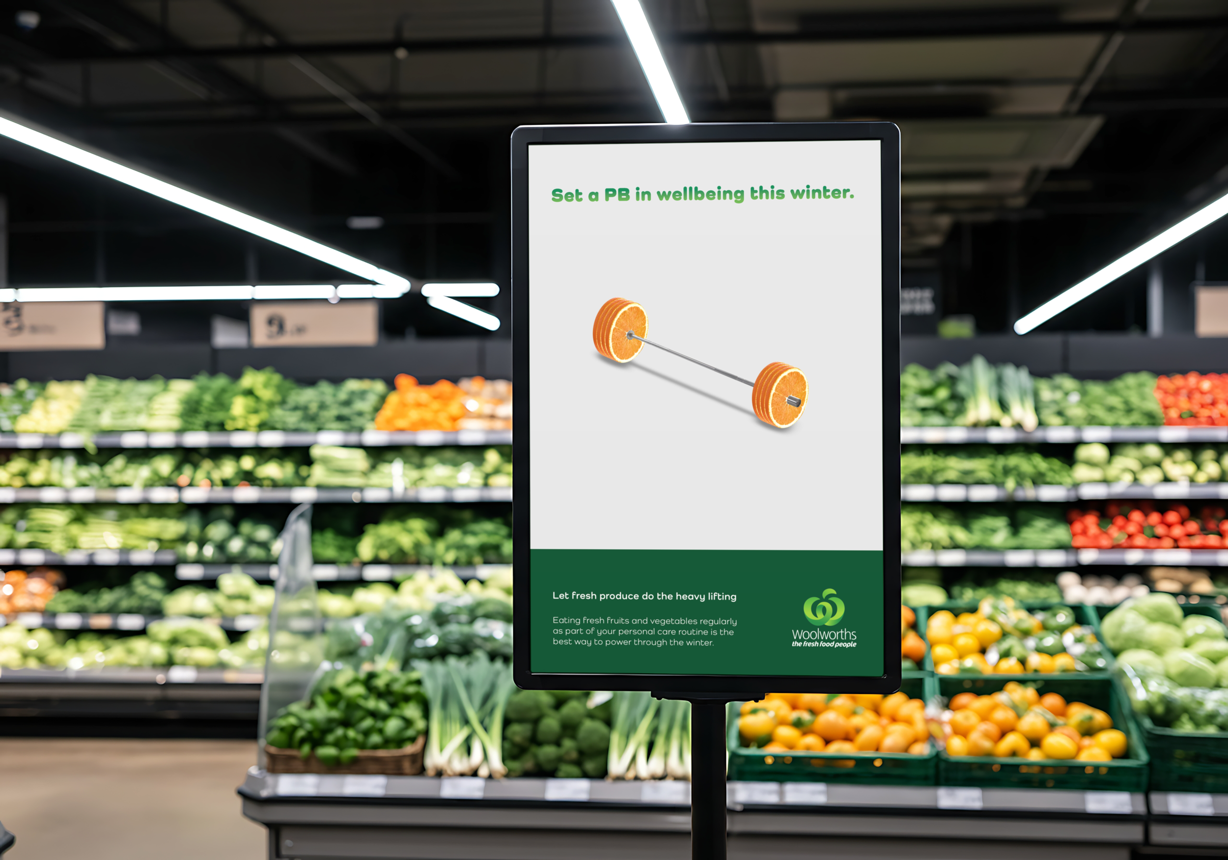
SMP: The best way to stay healthy this winter.
Woolworths wanted to position itself as the place to go for fresh fruits and vegetables so people could combat illness and stay healthy throughout the winter. With a heightened awareness due to recent viruses circulating at an increased rate, Woolworths wanted a magazine ad to remind people that Woolworths is where you can get all you need for a healthy diet.
SOLUTION
The idea was to leverage the natural health benefits of fruits and vegetables in maintaining a healthy immune function to combat illness, and provide you with a natural boost to your body’s defences.
EXECUTION
The method was to use visual metaphors as the hero and straight headlines to support the imagery. These visual metaphors would use something associated with immunity (a vial where vaccines are found) combined with the fresh fruits and vegetables Woolworths promotes.
A small amount of supporting copy at the bottom to reiterate the message and the logo at the base of the hierarchy as the final reminder of where people can go to boost their immunity naturally.
ANALYSIS
The concept is a strong idea, but my main criticism of this work is that the container where the greens are found may not be entirely obvious. Many other ideas were scamped but these designs made it into a digital format after some consideration.
The copy is supportive of the image and easy to understand, but all good visual metaphors do not really require copy, or at least, could stand on their own without it.
The supporting copy should also be more concise and impactful.